An ignorant person who hears the word “zebra” will associate it with the word “zebra” due to the alternation of white and black stripes. And it is right!
The specialist knows that under the name of the plant of the genus Microberlinia of the Caesalpiniaceae family, there is a zebrawood tree, the structure of the wood of which resembles the color of the African equid. In different regions it is called differently: mouk, allen ele, izingana, enuk-enug.
Where does zebrawood grow?
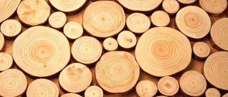
This is a typical representative of the tropics. It is most common in the western part of the African continent. It grows especially abundantly in countries such as Congo, Cameroon and Gabon. It looks like a single, wide-branched tree, reaching up to 40 m. The cross-section of the trunk is about 100 cm. The crown begins at a height of 20 m, leaving the entire area from the ground free.
Zebrawood tree
The planting is recognized as exotic and prone to extinction: it is under threat of destruction in the area of its natural growth. Attempts are now underway to urgently restore the number of these trees.
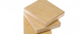
Finished goods
The main known uses, they should be taken in light of established practice. Important note: Some uses are mentioned for information (traditional, regional and antique items).
- Sliced veneer
- Upscale mahogany furniture
- Everyday furniture and its components
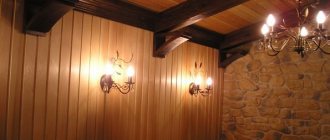
- Cladding panels
- Turning products
- Various wood products
- Tool handles (elastic wood)
- Load-bearing structures of wooden houses
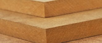
Properties
- The kernel is a pale golden hue, clearly separated from the sapwood.
- Features narrow stripes of many color variations (from black to light beige).
- May have spots of varying sizes.
- The structure is a curled plant with wavy and intersecting fibers.
- The texture is firm, heavy and a little rough.
- The dry density of wood is quite high and can reach from 750 to 800 kg per cubic meter.
- Hardness - 4.1 units. (4.1 kgf/sq. mm according to Brinell).
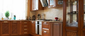
Basic rules for zebrano kitchen design
The word “zebrano” is not accidental: the wood in cross-section really resembles a zebra in color, since thin fibers of dark and light shades alternate exactly like wool on a zebra’s skin.
Zebrawood is easy to process, is not afraid of pests and, after appropriate treatment, tolerates high humidity and chemicals.
Thanks to such “inclinations”, wood has become widely used in the production of furniture, so today you can buy either a kitchen made of natural zebrawood or one simply lined with zebra veneer - both options have the right to life.
Let's look at the main rules that you need to follow when choosing a zebrawood kitchen.
Rule No. 1. Zebrano should be in moderation. Even without painting and varnishing, this is a very bright material, and if everything is made from it - the set, the table, and the floor - then your eyes will simply dazzle when you enter the kitchen.
The golden rule of the ensemble works here: the main color should appear twice - in a larger element and in an additional detail. This means that the kitchen set itself and, possibly, chairs can be ordered from zebrawood. Or make a wooden “apron” and the floor, leaving the kitchen itself monochromatic, plastic, for example.
Rule No. 2. When combining textures and materials, in addition to zebra, choose plain surfaces. Colorful tiles with lots of details, for example, or cheerful wallpaper that would be appropriate in another kitchen will simply get lost here.
Zebrawood goes well, with the right approach, with almost any color, cold and warm, bright and pastel. This is its obvious advantage, due to the fact that the wood itself has already collected different shades.
Rule No. 3. Combine different types of zebrawood in one kitchen. This is more of an advice than a rule: it is not necessary to do this, but it will look very impressive.
For example, you can make the upper façade of the kitchen from lighter wood, the lower one from dark wood, combining them with a neutral or, conversely, contrasting “apron”. You can assemble a kitchen in a checkerboard pattern, alternating deep and light shades of zebrawood.
Rule No. 4. You should not experiment with styles - zebrawood will look great in a high-tech, modern or minimalist design, but, to put it mildly, it is inappropriate in a classic kitchen, and even more so in an interior “weighted” with Victorian luxury.
This wood looks too exotic for these styles, so before buying a kitchen you need to carefully think about how the entire room will look. At the same time, you can safely add elements made of plastic, artificial or natural stone, and glass to the zebrawood.
Characteristics of wood
It is incredibly decorative, elite and rare. It has a fine-layer structure. It is characterized by increased strength and wear resistance. It lends itself well to chemical and mechanical treatment (especially grinding and polishing).
It is difficult to dry, requiring special conditions with strict adherence to temperature conditions and technologies. If this is not done, the material will come out cracked and warped. Positive properties include its inedibility for insects, as well as resistance to fungal infections.
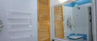
Bathrooms
Approximately the same tips apply to zebrano bathroom furniture. In the photo on the right you can see how well bright colors work. Pistachio, orange, apricot, bright yellow, bright blue, fuchsia, apple green, grass green, coral, scarlet and red colors go well with almost all types of zebrawood.
Compare two pictures:
You see that in the left photo zebrawood is combined with black and white - and the picture looks beautiful, but very strict. And in the right photo the colors are combined with chocolate, light yellow and bright orange, and the overall picture looks much more cheerful.
Of course, the overall picture depends not only on the accent colors, but also on the colors themselves, of which there are many.
Zebrawood texture
It is extremely interesting, due to which the tree has gained high popularity. Double color serves this purpose: distinct dark lines on a light surface make up a continuous picture of different densities. This gives the products bright expressiveness, expressiveness, contrast and dynamics. The stripes run predominantly in the longitudinal direction.
Zebrawood wood texture
There are many variations in color scheme, since the background, like the lines, can vary depending on the region:
- black;
- sand;
- brown;
- light beige;
- grey;
- ginger;
- caramel.
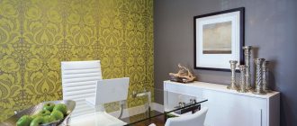
How to properly use zebrawood in the interior
Photo: buazeri.com
There is no point in overloading the interior with zebra stripes. This will greatly spoil the chic that you want to convey with the texture and zebrano pattern. With this type of wood, it is worth using textures and shades that are not similar in shade and are of the same color.
Photo aquatun.ru
For example, with dark zebrawood, you can safely use it with panels of plain, light wood. Frosted glass and metal surfaces will look good. Plain, bright, plastic surfaces.
The main rule is that what surrounds the zebra pattern should be concise, monochromatic and simple.
The video shows the zebrawood processing process
Subscribe to our Yandex.Zen channel
What is zebrawood used for?
Due to its highly decorative and exotic nature, its scope of application is elite. Thus, wood is used to make wall panels, veneer, exclusive design items, marquetry (inlay), furniture, and plywood cladding sheets.
Kitchen made from Zebrawood
Included in the interior trim of expensive cars (for example, Mercedes-Benz). Used for the production of knife handles, ski poles, guitar bodies, billiard cue inserts, and pistol grips.
Use in different styles
An elegant kitchen, made in natural tones, easily fits into the main modern styles:
- Minimalism. The facades of the set themselves serve as an accent detail; no other decorations are required.
Zebrawood facades without handles Source modularkitchenindia
- Modern. The casual design of the facades fits perfectly into the elegant style. The main thing is not to drown it out with many distracting accessories.
Modern Source static-ru.insales
- High-tech and loft. In an urban interior, a gray or beige set looks especially good. Its refined texture is pleasantly set off by the chrome-plated metal of lamps, kitchen appliances and utensils.
High-tech Source buildinn
- Contemporary (modern). A zebrawood kitchen will add elegance to a laconic modern style.
In a modern style Source i0.wp
- Fusion The eye-catching colors of the facades are a boon for an extravagant and cosmopolitan style.
You can't spoil porridge with oil Source ae01.alicdn
▍Siberian cedar, more precisely, cedar pine.
Pine family.
Density 484. The specimen of wood that came to me is just skinny pine, which has very little resin and, accordingly, a lot of wood. It is from skinny pine that the soundboards of guitars and other acoustic instruments can be made. In the middle of the last century, Leo Fender made the soundboards of the first prototypes of Esquires and Broadcasters, which later became Telecasters, from pine. And to this day, Fender has various models with pine bodies. Not Siberian, but musical, skinny, close in character to this example.
The spectrogram of cedar pine is generally similar to linden, only the dip at 2 kHz is slightly less pronounced. But there is an alder block at 1 kHz.
Comments
Anna says: 03/21/2013 at 7:25 pm Hello! I admire the site, a guide for non-professionals on how not to spoil the interior. The question is this. We are installing a kitchen - the top of 3 cabinets is warm olive, the bottom is dark wheat, the countertop is glossy wenge. I would like to make an apron from laminate. There is an interesting zebrawood laminate from the Maestro Bolero brand, walnut fantasy and its softer color combinations. Wouldn't such an apron scream? Or should I choose a solid color tree? Thank you!
anna says:
02/14/2013 at 7:29 pm Good afternoon. Please tell me, is it possible to combine 2 shades of zebrawood in one kitchen? For example: two cabinets (about 1.10 m wide) on both edges - zebrano in shade 33 or 24, wall cabinets above the work area in ivory color, work area cabinets - zebrano https://images.yandex.ua/ yandsearch?tld=ua&p=1&text=%D0%B7%D0%B5%D0%B1%D1%80%D0%B0%D0%BD%D0%BE%20%D0%B7%D0%B5%D0%BB %D0%B5%D0%BD%D1%8B%D0%B9&pos=38&rpt=simage&img_url=http%3A%2F%2Fwww.rimi-mebel.ru%2Fupload%2Fiblock%2F159%2F159c54733a7a6730ebaf3153b50bfb2e.jpg.
At the same time, the lower part of the farquk is light green, the upper part is ivory. In the kitchen, one wall is light green, all the rest are ivory. Floor – wood-look tiles 0.6*0.6m brown?
Alina says: 01/28/2013 at 10:09 am Hello! Very useful article. I have a question. We have a kitchen and a living room, separated by a large arch (3 meters). The total area of these premises is 50 m2. Half of the kitchen floor is light beige porcelain stoneware, the rest of the kitchen and living room floor is zebrano number 33. On the zebrano floor there is a white table and white chairs. We want to make the kitchen glossy white (it stands on porcelain stoneware). Tell me how to choose wallpaper for the walls? How to highlight the wall behind the kitchen (you wanted to make it brighter)? And is it necessary to choose the same wallpaper for the kitchen and living room? Is it possible to combine white wallpaper with flowers with zebrawood?
ticca says:
03/02/2013 at 5:28 am Yes, you can combine “white background + pattern” wallpaper with zebrawood, the main thing is that the pattern is not too small, otherwise it will ripple in the eyes. The drawing should be clear enough - the flowers should be clearly visible. The wall behind the kitchen can be made of any bright color, for example, pistachio would be ideal. The remaining walls in the kitchen can be made cream-colored so as not to overcrowd. And, of course, it is absolutely not necessary to choose the same wallpaper for the kitchen and living room.
Tatyana says: 04/12/2012 at 1:36 am Hello, please advise, we ordered a bedroom: the headboard of the bed is white gloss, and the body of the bed is zebrawood, and the bedside tables are in the same color, only the facades are white gloss. The predominant color in the wardrobe is white, only the side wall is colored and a couple of inserts, and our zebrano is not glossy https://ticca.ru/wp-content/uploads/zebrano-33.jpg. I would like to hear advice about the walls; soft purple would be suitable, or better yet, white walls and purple curtains and pillows. Please advise, otherwise we’ve already looked at millions of wallpapers, but we can’t choose anything.
ticca says:
04/12/2012 at 9:42 pm Oh, you know, I wouldn’t take risks with the soft purple color of the walls. The fact is that purple in any shade - both deep dark and delicate light - is a very active color, we always see it. This is not a neutral color, it always makes a clear statement. And you already have a fairly active object in the bedroom - this is zebrano furniture. But in general, soft purple walls suit you. But the overall picture of the bedroom interior may turn out to be too active and therefore tiring for you. Therefore, I would advise you this way. If you are ready to re-glue or repaint the wallpaper in a couple of years, then make it purple. And if you’re not ready, then, of course, it’s better to choose white for the walls and a beautiful purple fabric for curtains and pillows. It's easier to replace curtains than wallpaper!
Yulia says: 07/30/2012 at 8:22 am Good morning!!! We are renovating the room, it is both a living room and a bedroom. The wallpaper is light, the floor is darker than the walls and in the shape of a hut, but the color I chose for the cabinet was fino-cinnamon, will it match?
ticca says:
07/31/2012 at 7:07 pm To be honest, I didn’t understand what “a hut-shaped floor” means. If you explain what this is, I can answer you.
Julia says: 01/08/2012 at 12:19 pm The drawing on the linoleum https://www.stroymar.ru/product/1800/, and the wallpaper https://www.rasch-tapeten.de/en/articledetail/shoparticle /771220/shop/catalog/product/view/1400/modern_update_2012/ only diamond pattern. What color is the best upholstered furniture and do you need a carpet? Thank you.
ticca says:
01/08/2012 at 7:39 pm Now it’s clear. A carpet is completely optional - if you don’t need warmth, then linoleum itself is very nice and active, so you don’t need a carpet for decoration. Upholstered furniture will look good in a warm, rich green color - pistachio, avocado, lime, and green apple are ideal. It will be very elegant. In addition, you can use chocolate, apricot, and lingonberry colors.
Julia says: 02/08/2012 at 8:38 am Good morning!!! I'm more confused: will the color of the fino-cinnamon wardrobe be combined in this interior? Is this color warm or cool? I also chose aluminum for the cabinet profile. Thanks a lot.
ticca says:
03/08/2012 at 8:50 pm This color is warm. In my opinion, it is a little soft for such linoleum, but overall everything is fine, don't worry. The cabinet will not be discordant, and the aluminum profile will also work fine.
Marusya says: 07/26/2012 at 10:00 pm thank you very much, tissa! very convenient, beautiful and understandable site! and now the question) we want to combine a vanilla kitchen with a zebrano apron and countertop! What is the best way to make the walls and floor? and is it possible to add bright accents in dishes or furniture? for example, fuchsia?
ticca says:
07/27/2012 at 9:27 pm If I were you, I would refrain from using a zebrano apron - the color is good for a tabletop, but for an apron it will be too colorful. It’s better to make the apron a single color – for example, honey (to match one of the stripes). Yes, bright accents are very suitable, fuchsia and vanilla go well, and coral and pistachio are also suitable. I would make the walls milky white or cream, and the floor chocolate or brown.
Anonymous says: 07/25/2012 at 9:13 am Please tell me what color of doors is better to combine with the kitchen zebrawood bottom + white top (all glossy) ... they’ve already broken their minds, I really like walnut, but the shade is more yellowish, I’m afraid of ripples ...
ticca says:
07/27/2012 at 10:05 pm There’s nothing you can do, you need to select the doors to match the tone of one of the zebra stripes - you’re right to be afraid that another shade will give a discrepancy. Zebrano is both good and bad at the same time - it looks very impressive, but when discrepancies arise, all the beauty disappears. You need to look to match the tone of one of the stripes.
Elena says: 07/24/2012 at 10:45 pm I bought a zebrano and white bedroom set (https://casavera.ru/assets/images/bedroom/flora/flora_bed.jpg) Tell me what wall color to choose for the bedroom? The sun only appears in the morning. In addition, our flooring is wenge (brown). If you use wallpaper with a pattern on one of the walls, will it be too much?
ticca says: 07/27/2012 at 10:31 pm Why, no, there won’t be too much, the main thing is that the pattern is not too colorful and small, and a large pattern of saturated color will look good. For walls, taking into account the cardinal direction, all soft yellow and soft orange (peach and apricot shades) will work well.
Elena says:
06/18/2012 at 2:00 pm Thank you so much for the advice Tissa! I think your site is one of the best and useful, and clear, and simple! And communication with you is absolutely priceless! Thank you that there are people like you! For my zebrawood kitchen, I love your idea! And I had thoughts of making the apron either bright green or bright orange, and the walls, respectively, in the same tones, only pastel. My question is: “What can you make a kitchen splashback from (glossy white), other than tiles? P.S. I also like that you don’t answer everyone in a formulaic way, but read the question carefully!
ticca says:
06/18/2012 at 3:26 pm There is glossy white glass like here https://ticca.ru/wp-content/uploads/fartuk-dlya-kuhni-iz-stekla-56.jpg, and if there is a wall under it paint it with white paint, you will have the desired effect. However, you need to be careful when choosing glass - some of these glasses have a bluish or grayish tint, which is undesirable for you. In general, look at this article https://ticca.ru/fartuk-dlya-kuhni-iz-stekla-stali-kamnya/, maybe you’ll find some other ideas